Fitness Design System
As Garmin redefined its visual direction for fitness wearables, I led the visual design for fitness wearable: Vivoactive 6 and Venu X1. These were the first to adopt a the new UI visual system.
Beyond aesthetics, I initiated and built a modular UI design system. This system addressed long-standing visual inconsistencies and enabled scalable cross-device consistency across round and square displays and varied resolutions.
This sharpened my ability to design component-based UI systems that preserve both brand identity and functional clarity across platforms, key to shipping high-quality, extensible design.
My Role
My Role
UI Designer
Design System Lead
UI Designer
Design System Lead
Duration
Duration
12 months, 2025
12 months, 2025
Product Team
Product Team
1 Lead UI Designer
2 UI Designers
1 Lead UI Designer
2 UI Designers
Deliverables
Deliverables
System UI Visual Style
Design System
UI Design
UI/UX Kick-Off
UI Flow & Architecture
//Discovery
//Discovery
Problems at Hand
Problems at Hand
A rapid design audit of Vivoactive 6 and Venu X1 revealed three systemic pain points that fragmented the experience, slowed delivery and QA efforts.
A rapid design audit of Vivoactive 6 and Venu X1 revealed three systemic pain points that fragmented the experience, slowed delivery and QA efforts.
I started by understanding Lily’s product context, to make sure every design decision aligned with its brand and target users.
This strategic foundation ensured the watch face designs felt cohesive with the overall experience and highlighted what sets Lily apart within Garmin’s lineup.
Accessibility & Usability Gaps
Accessibility & Usability Gaps

Insufficient text-background contrast -> legibility
Insufficient text-background contrast -> legibility
Insufficient text-background contrast -> legibility

Ambiguous hint icon -> confuses users
Ambiguous hint icon -> confuses users
Ambiguous hint icon -> confuses users

"Ready" label competes visually with "Run" title.
"Ready" label competes visually with "Run" title.
"Ready" label competes visually with "Run" title.

Bottom chevron pulls focus from the primary CTA
Bottom chevron pulls focus from the primary CTA
Bottom chevron pulls focus from the primary CTA
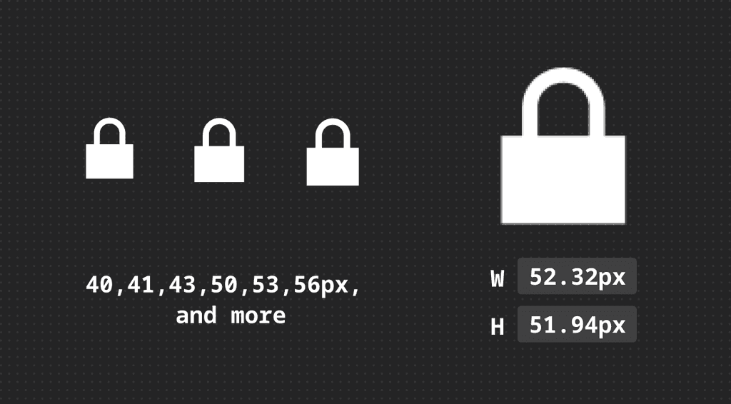
Visual Inconsistencies
Visual Inconsistencies
30+ sizes across icons, buttons, and lists
30+ sizes across icons, buttons, and lists
30+ sizes across icons, buttons, and lists
Odd-sized icons (41px, 53px)
Odd-sized icons (41px, 53px)
Odd-sized icons (41px, 53px)
Pixel-imperfect values (51.94 px instead of 52 px)
Pixel-imperfect values (51.94 px instead of 52 px)
Pixel-imperfect values (51.94 px instead of 52 px)
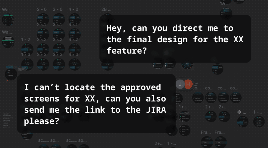
Cross-Disciplinary Misalignement
Cross-Disciplinary Misalignement
No common library between UI, UX & Engineering
No common library between UI, UX & Engineering
No common library between UI, UX & Engineering
Designers hunting for approved assets, and engineers missing redlines
Designers hunting for approved assets, and engineers missing redlines
Designers hunting for approved assets, and engineers missing redlines
Designers hunting for approved assets, and engineers missing redlines
Inconsistent templates prolonged hand-off and QA cycles
Inconsistent templates prolonged hand-off and QA cycles
Inconsistent templates prolonged hand-off and QA cycles
Inconsistent templates prolonged hand-off and QA cycles
//Research
//Research
Benchmarking Wearables Playbook
Benchmarking Wearables Playbook
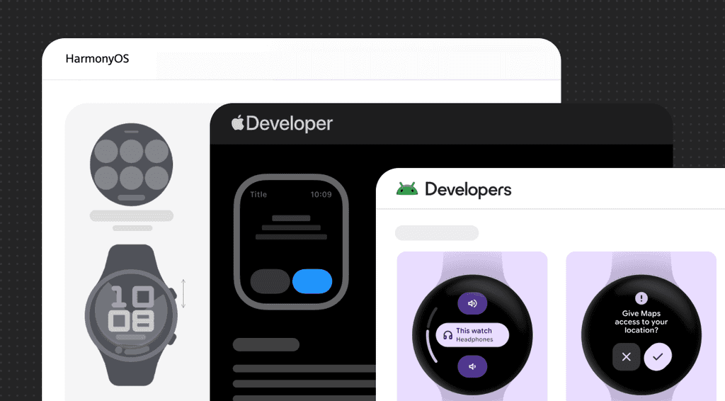
To ground my approach, I reverse-engineered wearable guidelines from Google Wear OS, Apple watchOS, Samsung Wear OS, and Huawei HarmonyOS.
Using Atomic Design Principles, I converted the elements into a reusable component hierarchy, laying the groundwork for Garmin's first cross-device UI system.
To ground my approach, I reverse-engineered wearable guidelines from Google Wear OS, Apple watchOS, Samsung Wear OS, and Huawei HarmonyOS.
Using Atomic Design Principles, I converted the elements into a reusable component hierarchy, laying the groundwork for Garmin's first cross-device UI system.
I started by understanding Lily’s product context, to make sure every design decision aligned with its brand and target users.
This strategic foundation ensured the watch face designs felt cohesive with the overall experience and highlighted what sets Lily apart within Garmin’s lineup.
// Defining Design System Guidelines
// Defining Design System Guidelines
How can I, create a design system that is simple, scalable & understandable by designers & developers?
How can I, create a design system that is simple, scalable & understandable by designers & developers?
Grid System
Grid System
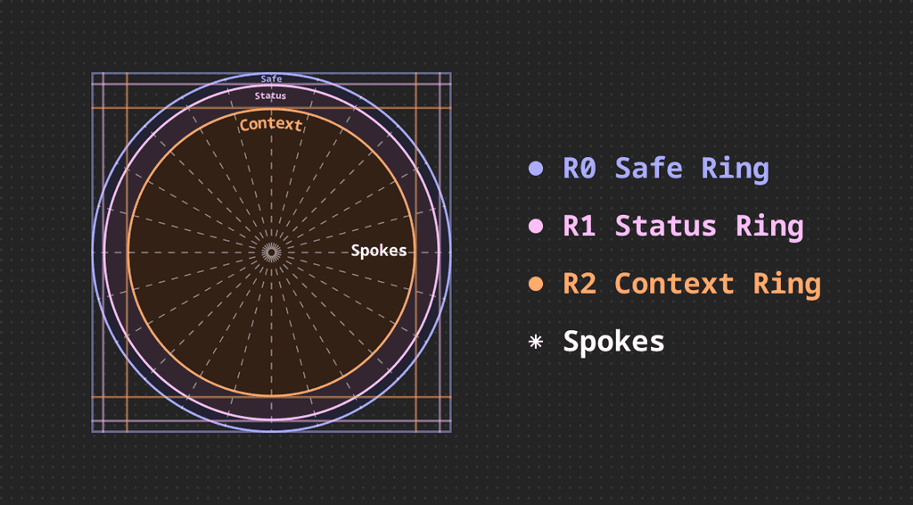
Radial Grids for Non-Scrolling Screens
R0 - Safe Ring
swipe handles, scroll bars, page indicators
R0 - Safe Ring
swipe handles, scroll bars, page indicators
R0 - Safe Ring
swipe handles, scroll bars, page indicators
R0 - Safe Ring
swipe handles, scroll bars, page indicators
R1 - Status Ring
header, battery, connections
R1 - Status Ring
header, battery, connections
R1 - Status Ring
header, battery, connections
R1 - Status Ring
header, battery, connections
R2 - Context Ring
titles, buttons, graphs, linear progress & gauges
R2 - Context Ring
titles, buttons, graphs, linear progress & gauges
R2 - Context Ring
titles, buttons, graphs, linear progress & gauges
R2 - Context Ring
titles, buttons, graphs, linear progress & gauges
Spokes
buttons, graph axis, button hints
Spokes
buttons, graph axis, button hints
Spokes
buttons, graph axis, button hints
Spokes
buttons, graph axis, button hints
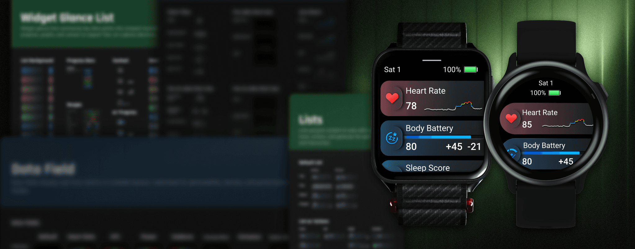
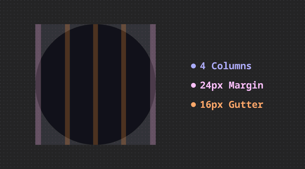
Margin Grids for Scrolling Screens
Combine a central rectangular sub-grid with the polar periphery:
Combine a central rectangular sub-grid with the polar periphery:
Combine a central rectangular sub-grid with the polar periphery:
Keep body text, lists, and forms within the content cylinder
Keep body text, lists, and forms within the content cylinder
Keep body text, lists, and forms within the content cylinder
Keep body text, lists, and forms within the content cylinder
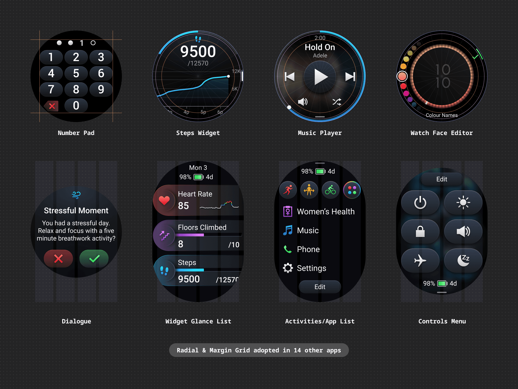
Dialogues, widget Glance Lists, Activities/App List, Controls Menu, General Menu
Dialogues, widget Glance Lists, Activities/App List, Controls Menu, General Menu
Dialogues, widget Glance Lists, Activities/App List, Controls Menu, General Menu
Dialogues, widget Glance Lists, Activities/App List, Controls Menu, General Menu
Standardise Components, Styles & Sizes
Standardise Components, Styles & Sizes
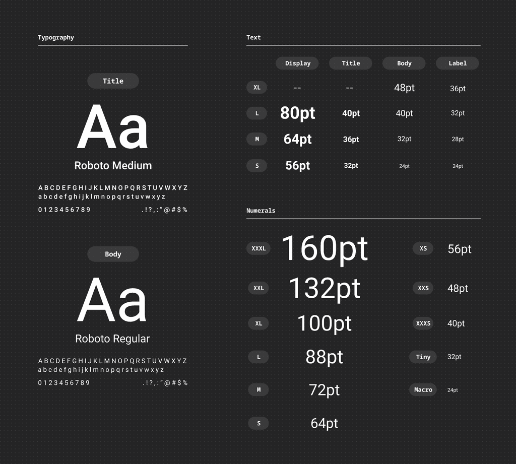
Typography
Sizes step in 8 pt increments to match Garmin’s grid. This keeps line-height and component padding perfectly aligned.
Sizes step in 8 pt increments to match Garmin’s grid. This keeps line-height and component padding perfectly aligned.
Sizes step in 8 pt increments to match Garmin’s grid. This keeps line-height and component padding perfectly aligned.
9 text sizes
Roboto Medium for titles, Roboto Regular for body copy, for instant hierarchy
9 text sizes
Roboto Medium for titles, Roboto Regular for body copy, for instant hierarchy
9 text sizes
Roboto Medium for titles, Roboto Regular for body copy, for instant hierarchy
11 numeral sizes
Keep 4-digit metrics crisp in data-dense layouts, eliminating truncation
11 numeral sizes
Keep 4-digit metrics crisp in data-dense layouts, eliminating truncation
11 numeral sizes
Keep 4-digit metrics crisp in data-dense layouts, eliminating truncation
Icon Sizes
Standardised icons mapped to clear roles, including labels, headers, buttons, and hero visuals.
Standardised icons mapped to clear roles, including labels, headers, buttons, and hero visuals.
Standardised icons mapped to clear roles, including labels, headers, buttons, and hero visuals.
XS
S
M
L
XL
XXL
XS
S
M
L
XL
XXL
XS
S
M
L
XL
XXL
(32px)
(40px)
(48px)
(56px)
(72px)
(104px)
(32px)
(40px)
(48px)
(56px)
(72px)
(104px)
(32px)
(40px)
(48px)
(56px)
(72px)
(104px)
: Label icons
: Headers, Hints
: Buttons
: Headers, Lists, Buttons, Toasts
: Buttons
: Hero icons
: Label icons
: Headers, Hints
: Buttons
: Headers, Lists, Buttons, Toasts
: Buttons
: Hero icons
: Label icons
: Headers, Hints
: Buttons
: Headers, Lists, Buttons, Toasts
: Buttons
: Hero icons
Accessibility & Usability
Accessibility & Usability
Colours
Black first palette for power savings and bezel blend
Black first palette for power savings and bezel blend
Black first palette for power savings and bezel blend
Achieved WCAG AAA rating for at least 7:1 in contrast ratio to ensure legibility in both outdoor and indoor environments
Achieved WCAG AAA rating for at least 7:1 in contrast ratio to ensure legibility in both outdoor and indoor environments
Achieved WCAG AAA rating for at least 7:1 in contrast ratio to ensure legibility in both outdoor and indoor environments
Incorporate semantic colour accents to help users grasp status at a glance without needing extra explanation. For example, red for heart rate, urgent assistance, disruptive actions. Green for start activity, success, positive actions.
Incorporate semantic colour accents to help users grasp status at a glance without needing extra explanation. For example, red for heart rate, urgent assistance, disruptive actions. Green for start activity, success, positive actions.
Incorporate semantic colour accents to help users grasp status at a glance without needing extra explanation. For example, red for heart rate, urgent assistance, disruptive actions. Green for start activity, success, positive actions.
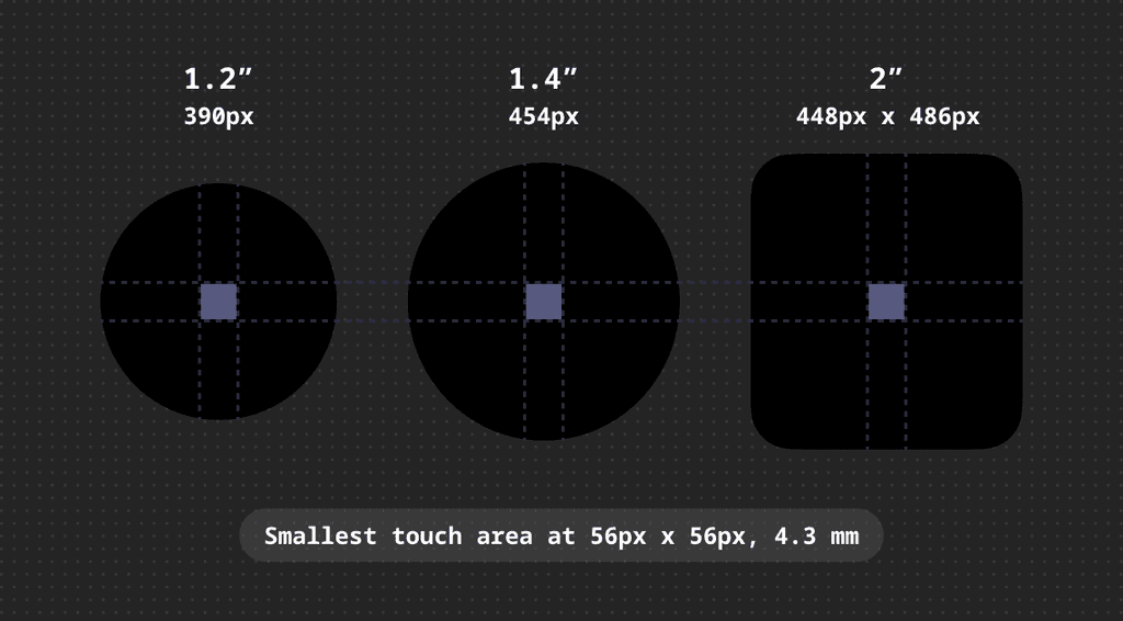
Touch Area
Every actionable element meets a minimum 56 × 56 px (≈ 4.3 mm) hit target to ensure reliable taps even on small watches or sweaty fingertips.
Every actionable element meets a minimum 56 × 56 px (≈ 4.3 mm) hit target to ensure reliable taps even on small watches or sweaty fingertips.
Every actionable element meets a minimum 56 × 56 px (≈ 4.3 mm) hit target to ensure reliable taps even on small watches or sweaty fingertips.
PORTFOLIO
PORTFOLIO
PORTFOLIO
CHECK OUT SOME MORE
CHECK OUT SOME MORE

Lily 2 Active Hero Watch Face
Lily 2 Active Hero Watch Face
Lily 2 Active Hero Watch Face

Visual Strategy
Brand-Driven UI
Stakeholders Alignment
Lily 2 Active Hero Watch Faces
Lily 2 Active Hero Watch Faces
Lily 2 Active Hero Watch Faces
Visual Strategy
Brand-Driven UI
Stakeholders Alignment
Lily 2 Active Hero Watch Face
Lily 2 Active Hero Watch Face
Lily 2 Active Hero Watch Face
Visual Strategy
Brand-Driven UI
Stakeholders Alignment
Lily 2 Active Hero Watch Face
Lily 2 Active Hero Watch Face
Lily 2 Active Hero Watch Face
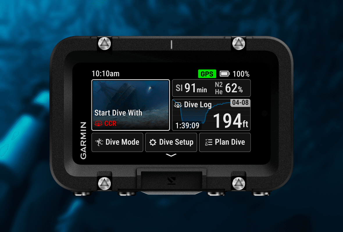
Descent X50i
Descent X50i
Descent X50i
Lead UI
Competitor Analysis
Modular UI Design
System UI
Descent X50i
Descent X50i
Descent X50i
Lead UI
Competitor Analysis
Modular UI Design
System UI
Descent X50i
Descent X50i
Descent X50i
Lead UI
Competitor Analysis
Modular UI Design
System UI